MEMA
A leading manufacturer's association engages BasedOn to evolve its historic brand and grow membership while driving awareness and advocacy on Capitol Hill.

MEMA is all about its members: over 1,000 automotive and mobility parts suppliers who work across various sub-groups to address issues central to manufacturing and mobility. Given this decentralized structure, members had come to identify more closely with their specific industry subgroups rather than with MEMA. Our team developed a comprehensive brand that unified these subgroups under one identity—MEMA—positioning it as both a connector and a champion for its members.
Strategy
With members passionately identifying with their subgroups, our challenge was to create a new naming architecture that would align these suppliers versus alienate. We partnered with MEMA leadership and these membership sub-groups to develop a brand framework that balanced the need for a strong, prominent MEMA brand against MEMA's legacy of distinct, member-led sub-groups. Through interviews, archetype exercises, surveys and workshops, we identified a shared truth where members and leadership could align: MEMA is Strong by Association.
Brand Idea
Strong By Association
MEMA empowers the vehicle suppliers community with the strength and certainty to take action for themselves, their businesses and their industry.

Architecture
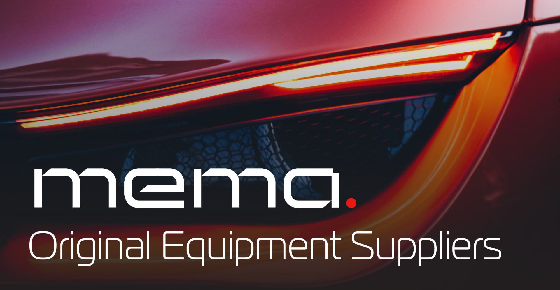
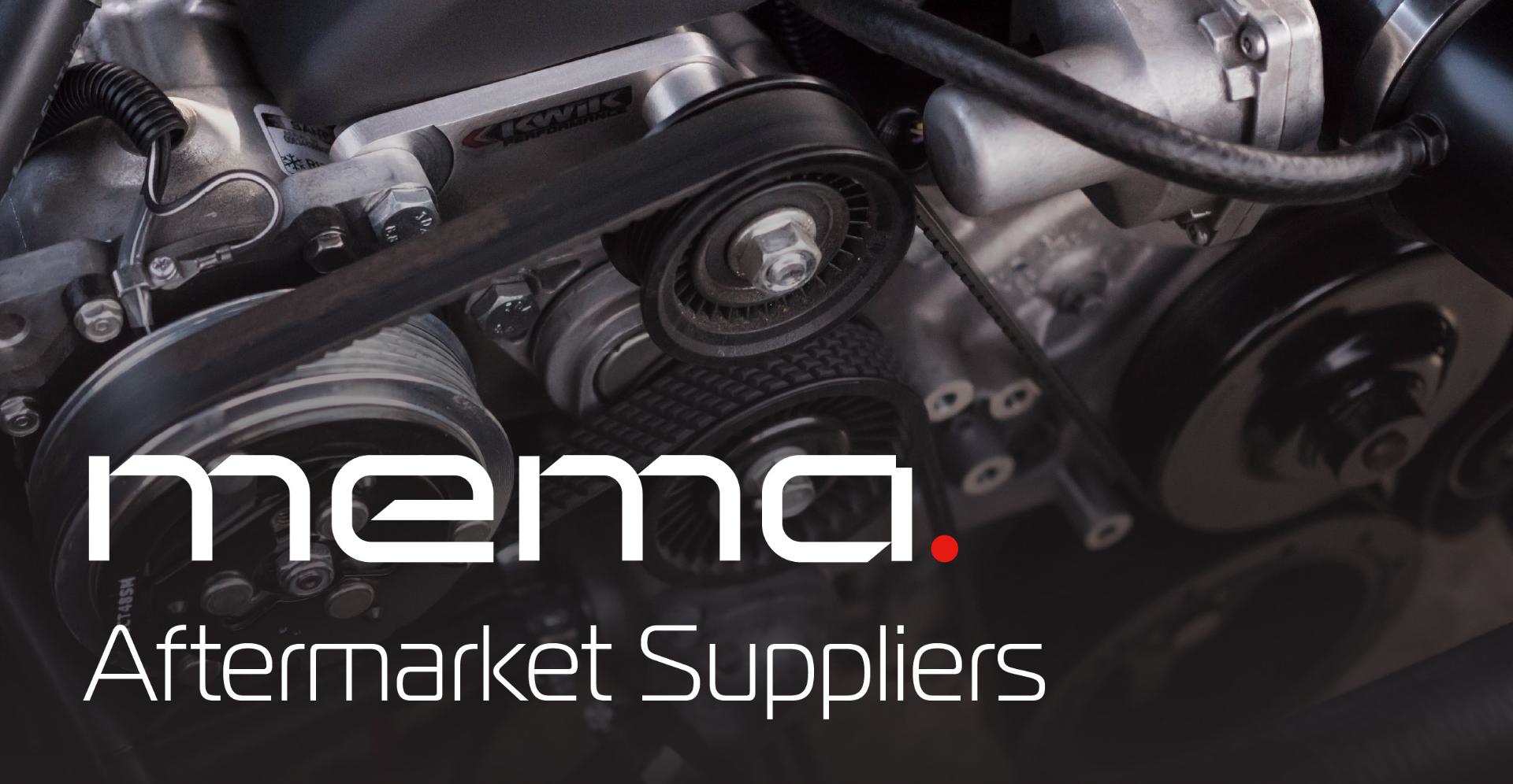
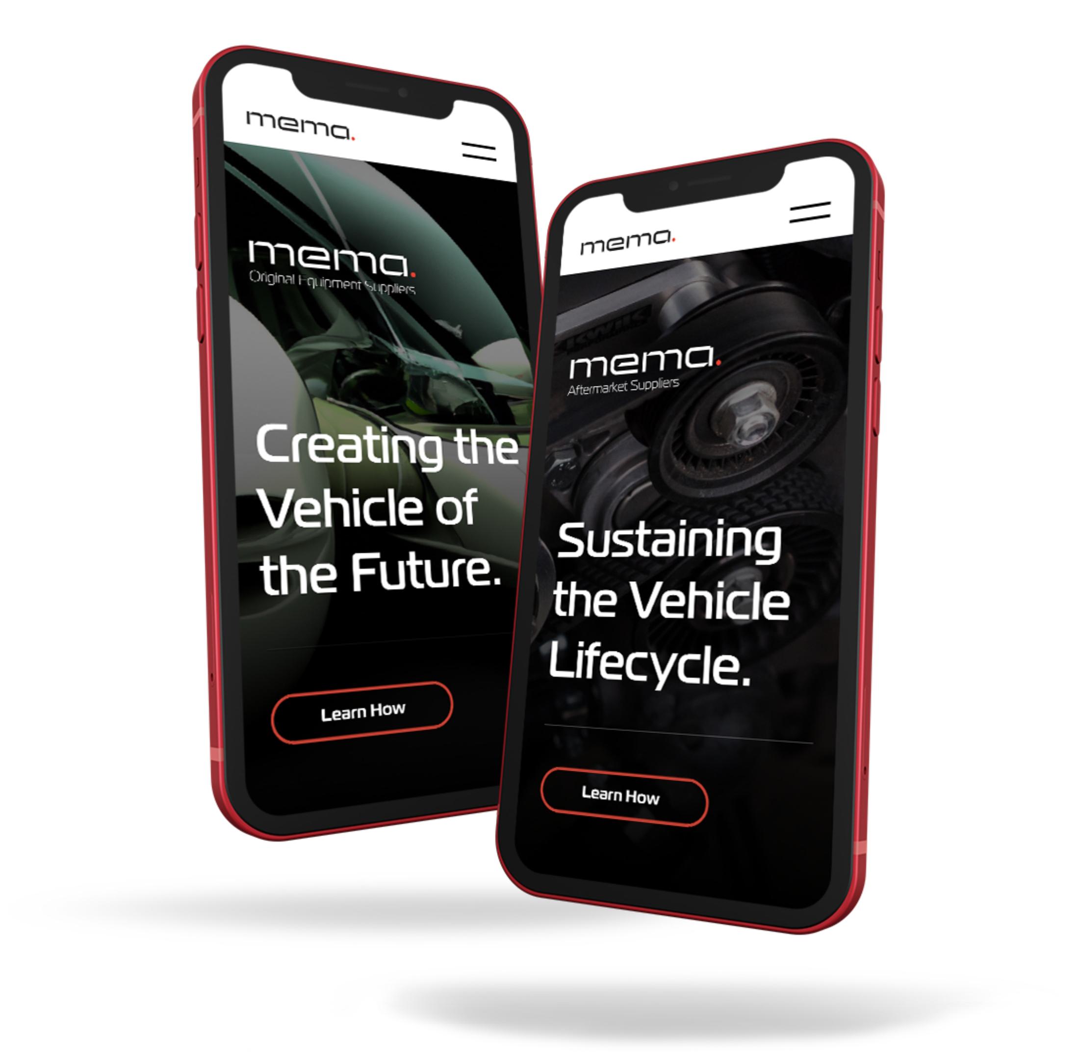
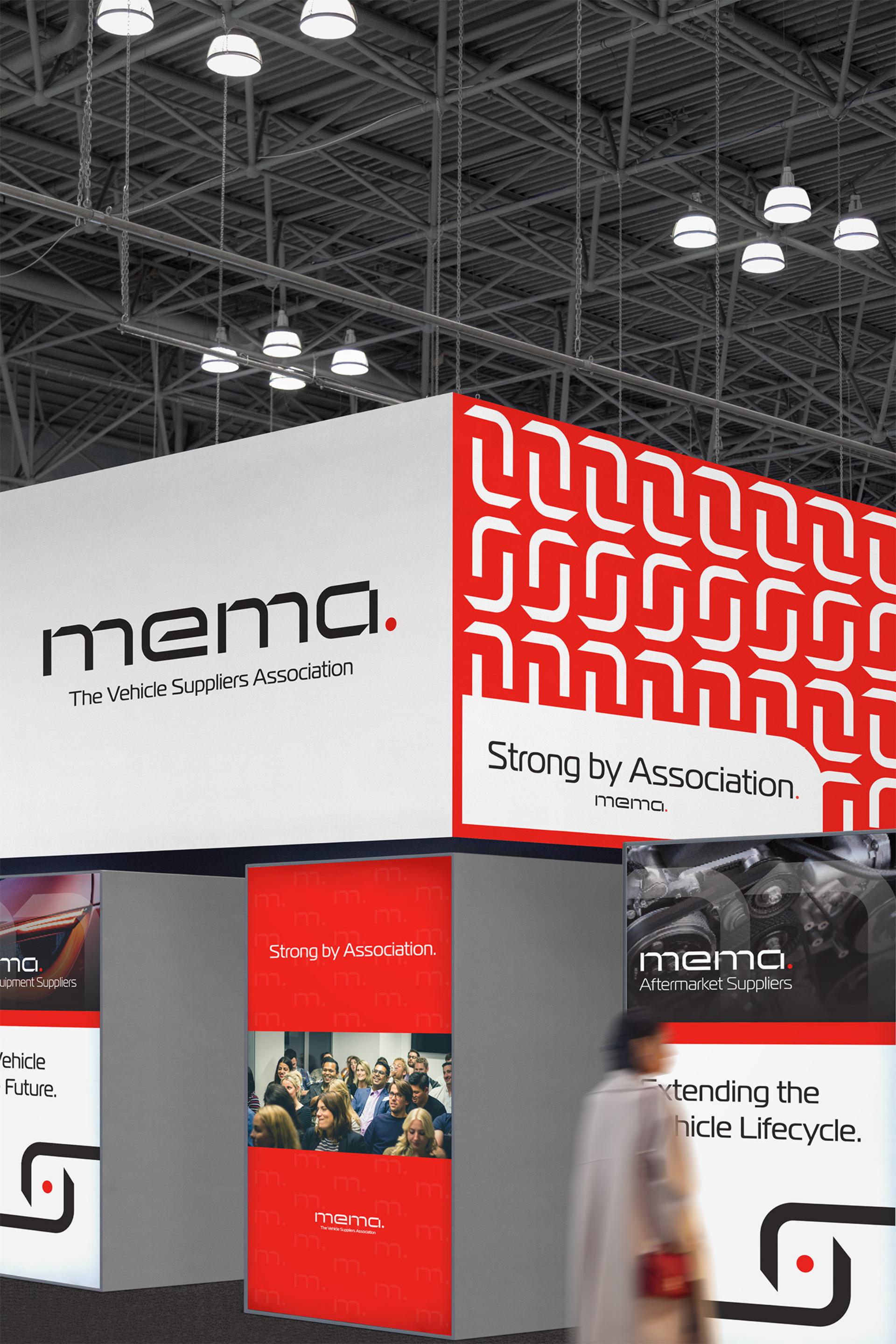
Our team developed an architecture under the MEMA master brand with related names that clarified and brought renewed purpose to the sub-groups. Four sub-groups now streamlined into two: Original Equipment Suppliers and Aftermarket Suppliers, both designed in a new brandmark system.
Verbal + Visual Identity
Finding Their Voice
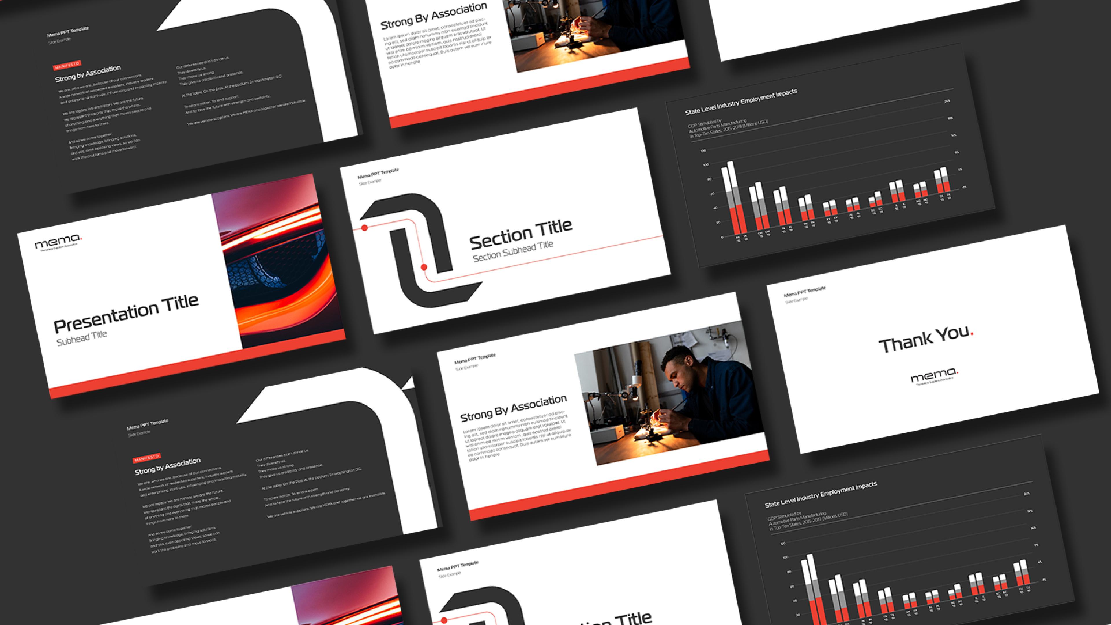
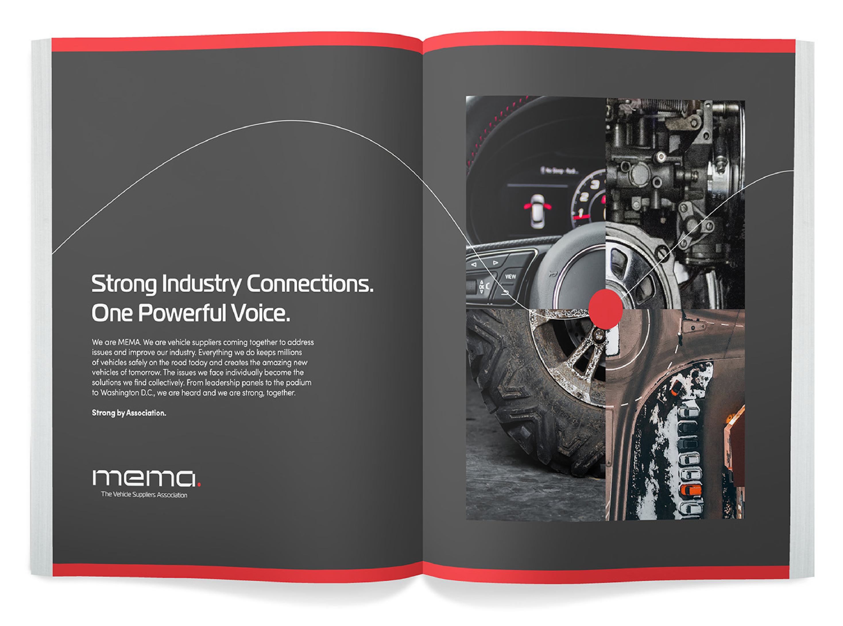
Now MEMA would speak as one without losing the personalities of the two new distinct subgroups. Our writers developed a verbal identity that was strong, precise and inspiring. We designed verbal guidelines to be clear and concise, ensuring and empowering membership and leadership to speak with a unified, authoritative voice.
- Strong
- Precise
- Inspiring
Before
After
Brandmark
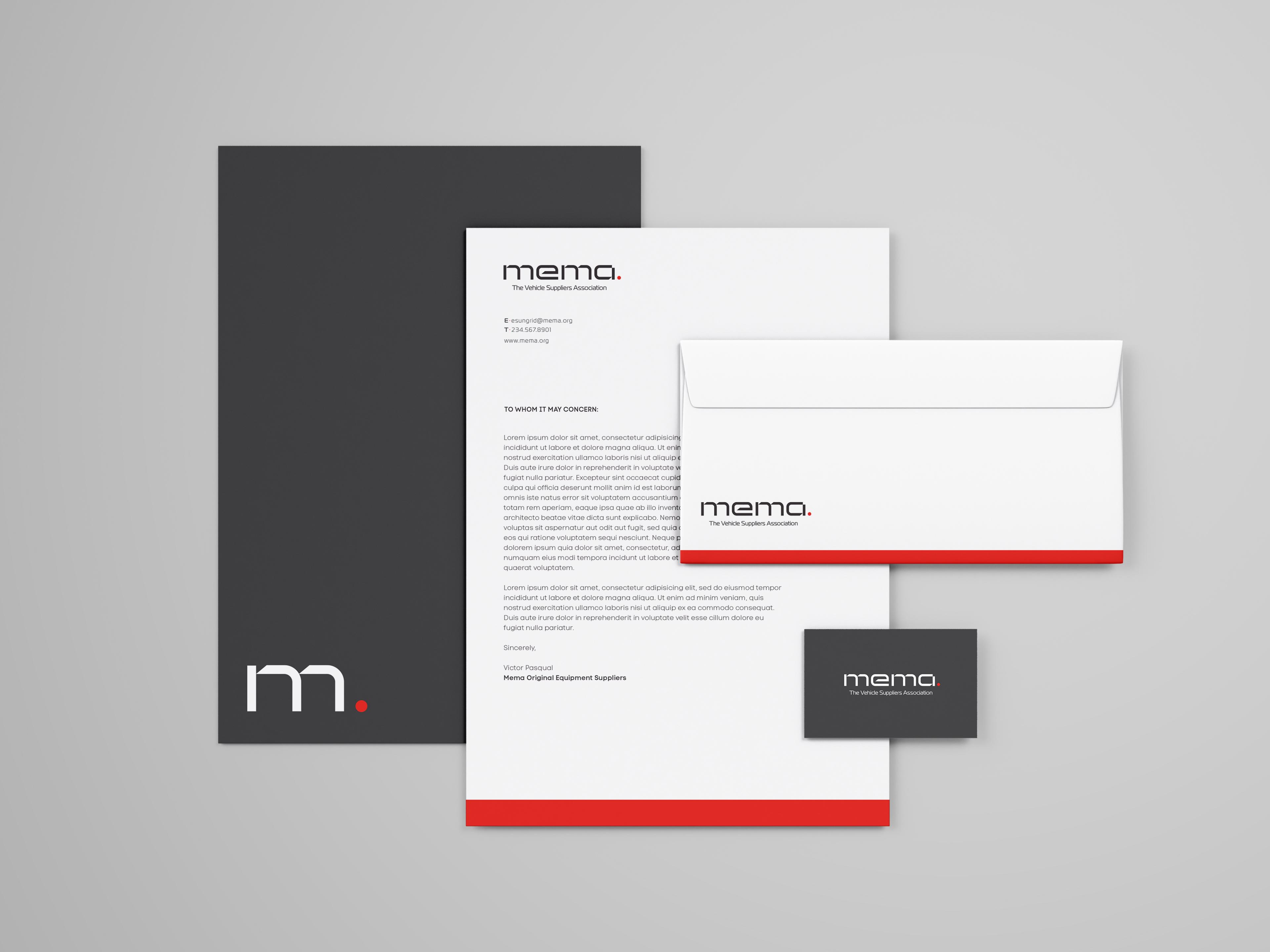
Our design team evolved the MEMA brandmark, reimagining legacy elements—such as the signature circle—as new symbols to represent members and MEMA's role as having a 360-degree view of the automotive and mobility industries. Our designers collaborated with our strategy department and MEMA membership and leadership to subsequently create congruent visual identities for MEMA's two sub-groups: MEMA-Original Equipment Suppliers group and Aftermarket Suppliers group. We designed deliverables to empower member sub-groups through distinct visual identities, descriptors, brand lines, and photography that meaningfully reflected their distinct specialties and personalities.
Brand Rollout
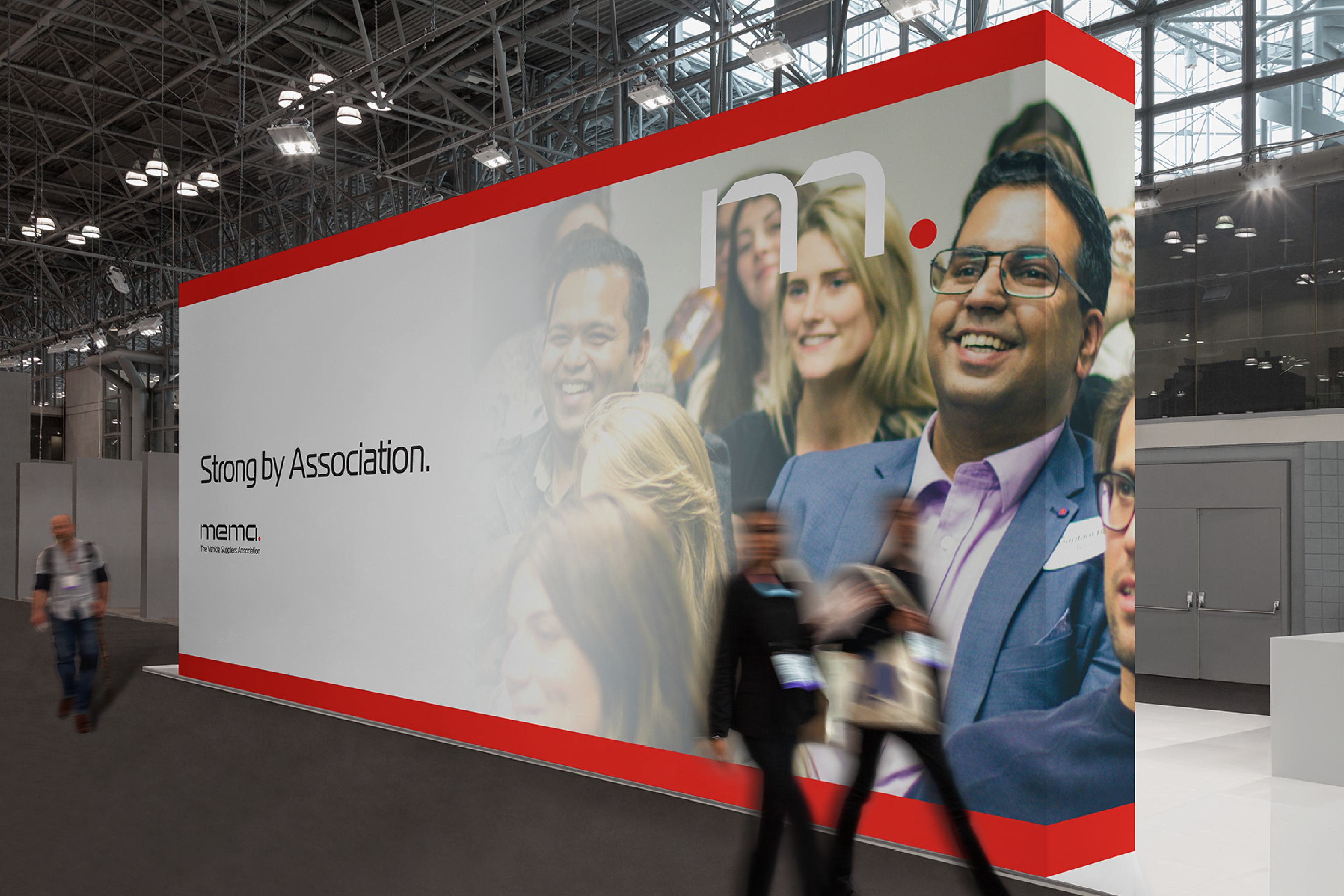
Some of the first pieces to introduce the new streamlined MEMA organization to the world came during an association event. Banners directed members to the new MEMA booth with new graphics and a narrative expressing the vision of this historic brand. An ad in the program, markers throughout the event, and a video with a new manifesto, redefined their purpose and dramatized the connections that made them Strong by Association.
“The BasedOn team has been one of the most strategic, creative and efficient brand-marketing companies I have ever worked with in my decades as a CEO and marketer. BasedOn took a very complex organization and house of brands and transformed us into a powerful, cohesive, unified organization positioned for the future. We are truly ‘Strong by Association.’”
Bill Long
MEMA President and CEO
Summary
MEMA is a historic brand that has stood the test of time. Our team helped modernize it, fast forwarding over 100 years to better reflect their diverse membership and leadership in the industry. With a new durable brand framework, clear sub-group architecture, and precise verbal and visual identity, MEMA has created a powerful presence that can affect change on Capitol Hill and across the entire industry.