A leader in education and youth development makes a move toward a stronger brand identity.
Racquet Up Detroit (RUD) is a youth development program for young Detroiters eager to build a great future and great friendships. By engaging youth from the 5th grade through 12th, this dynamic organization seeks to impact these young lives at the right time and in what has become the perfect place—a squash court. As students learn about the game and friendly competition through tournaments, educational programs, college prep and community service, they also learn about themselves and life-building skills that will propel them forward through life. At our studio, our team developed an identity and story that captures the powerful connections helping Detroit’s youth realize their full potential.
Strategy
For our discovery process, we began with interviews of stakeholders, visiting their Northwest Activity Center and the construction site of their new state-of-the-art facility. Racquet Up places equal importance on the individual as well as the player, with classrooms near courts to cover a robust curriculum for growth. Here, squash becomes the great facilitator, as participants build life skills that serve them on and off the court, like confidence, good sportsmanship and teamwork. Meanwhile, classes nearby enable mentor and mentee to move from one dynamic experience to another, setting goals, setting up for achievement and building character.
After talking with teens and parents and seeing coaches and players in action, we began our strategic process by uncovering a brand personality that defined the mentor/mentee relationship. With their gift for encouragement, these mentors put head and heart into play every day and we found a common personality that defined both the people and the brand: the big-hearted coach. We then created a brand idea that reflected both the organization's purpose and each youth's trajectory towards their future: Potential in Motion.
Brand Personality
The Big-Hearted Coach
Brand Idea
Potential in Motion
Verbal + Visual Identity
Like golf and tennis, squash is a sport with longevity. Since it can benefit a person physically, mentally and socially for a lifetime, Racquet Up Detroit was conscientious about building trusting and respectful long-term relationships with each young person and their families. Squash is also a sport with a national network; it is a development tool that creates a lasting bond within the sporting community, extending across the country through the Squash+Education Alliance.
Emphasizing this balance between longevity and connection, we chose voice words like confident, warm and inclusive. Our team designed messaging with optimism, a spirit of joy and fun, that projected future achievement and mastery through levels of development. Such verbal expressions, combined with a bold, visual identity, made communications impactful.
Ready to Activate Each Person's Potential.
The Racquet Up Detroit name and brandmark are significant elements of this identity. "Racquet Up" is a squash term which means to hold up your racquet in readiness, always prepared. It is exactly this preparedness that the organization embraces throughout their brand's verbal and visual expressions. The Racquet Up brandmark is a symbol of the organization and includes the wordmark and an icon as a brandmark system. This flexibility allows Racquet Up Detroit to effectively communicate in different scenarios while maintaining strong recognition.
Key assets also include the primary color palette and illustrative line work as graphic devices reflecting both the sport and personal potential. Diagonal and geometric lines express energy and upward trajectory, both aspects of the sport and personal development. Game details like “angle” in play where players shoot up toward the wall are represented by line work. Similarly the color palette represents the yellow dots marking balls, denoting whether players are competitive or professional. Meanwhile silhouette graphics highlight the students and tell their stories in a bold way.
Racquet Up Detroit puts potential in motion with young Detroiters—from 5th through 12th grade and beyond—through education programming, field trips and tournaments, college preparation, community service, and the game of squash. Racquet Up Detroit is there for each young person as they continue to reach towards their full potential.
We Are Racquet Up Detroit
Manifesto
We play squash, our way of connecting and building relationships that last a lifetime. And while that's how we're known, that does not define who we are.
We are adventurers, equipped with optimism and experience. We are energized by helping others on their journey to explore, experience and be ready for all life has to offer.
We are mentors, who put both head and heart into play. We are experienced and confident in our approach, and also open-minded and flexible as our understanding of the world expands.
We are family, committed to working together and inspired by mutual compassion and respect. We bring resources, unwavering care, and supportive structure so
that people can effectively learn, take risks, and grow.
We are prepared for the opportunities ahead, and ready for the challenge.
We are ready to put potential in motion.
Potential in Motion
“After more than 10 years in operation, last summer seemed like a good time to check in on our identity. So, with the expert help of BasedOn, our favorite Detroit-based design firm, we took a look in the mirror—what do we stand for and how do we present Racquet Up Detroit to the world? The big idea we uncovered is this: Racquet Up puts POTENTIAL IN MOTION.”
Derek AguirreExecutive Director
At Racquet Up Detroit, We Put Both Head and Heart Into Play.
At Racquet Up Detroit, We Are
Ready to Activate Each Person's Potential.
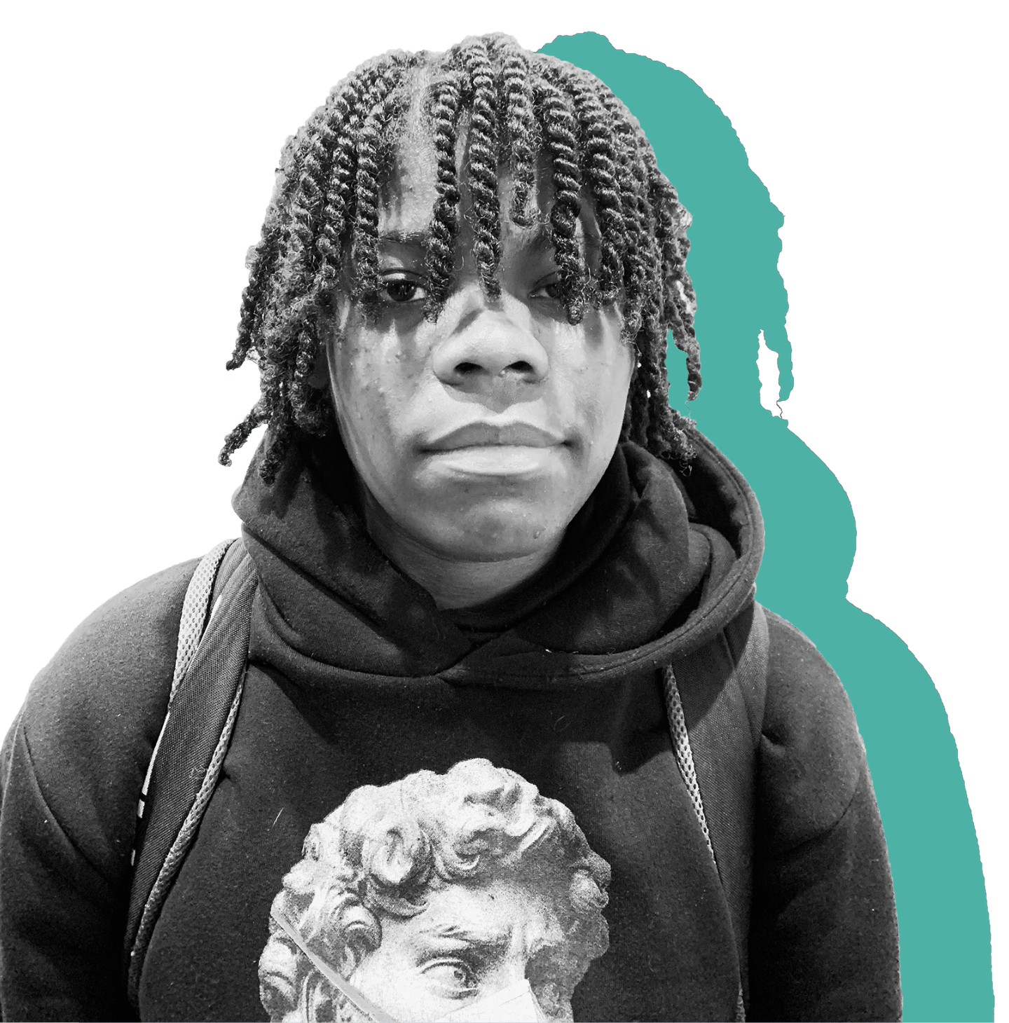
Meet Our Graduates
Alani and Ta'Nia
“The new classrooms are my favorite part. There are nicer tables and chairs and we have more places to work. The glass courts are cool too.”
Khalif Edwards 8th Grade
We Are Prepaired For Opportunities Ahead, And Ready for the Challenge.
Summary
Racquet Up Detroit is a warm and inclusive
community – a family committed to working together.
To tell their story, our team developed a verbal and visual
identity flexible enough to continually provide a launch pad for
their motivational messaging. With a bold and
uplifting logo and brandmark treatment, illustrative
devices, distinctive color palette, and a strong voice
to engage youth, this brand moves
young lives. With these brand tools in hand, Racquet Up
Detroit continues to smash it.